
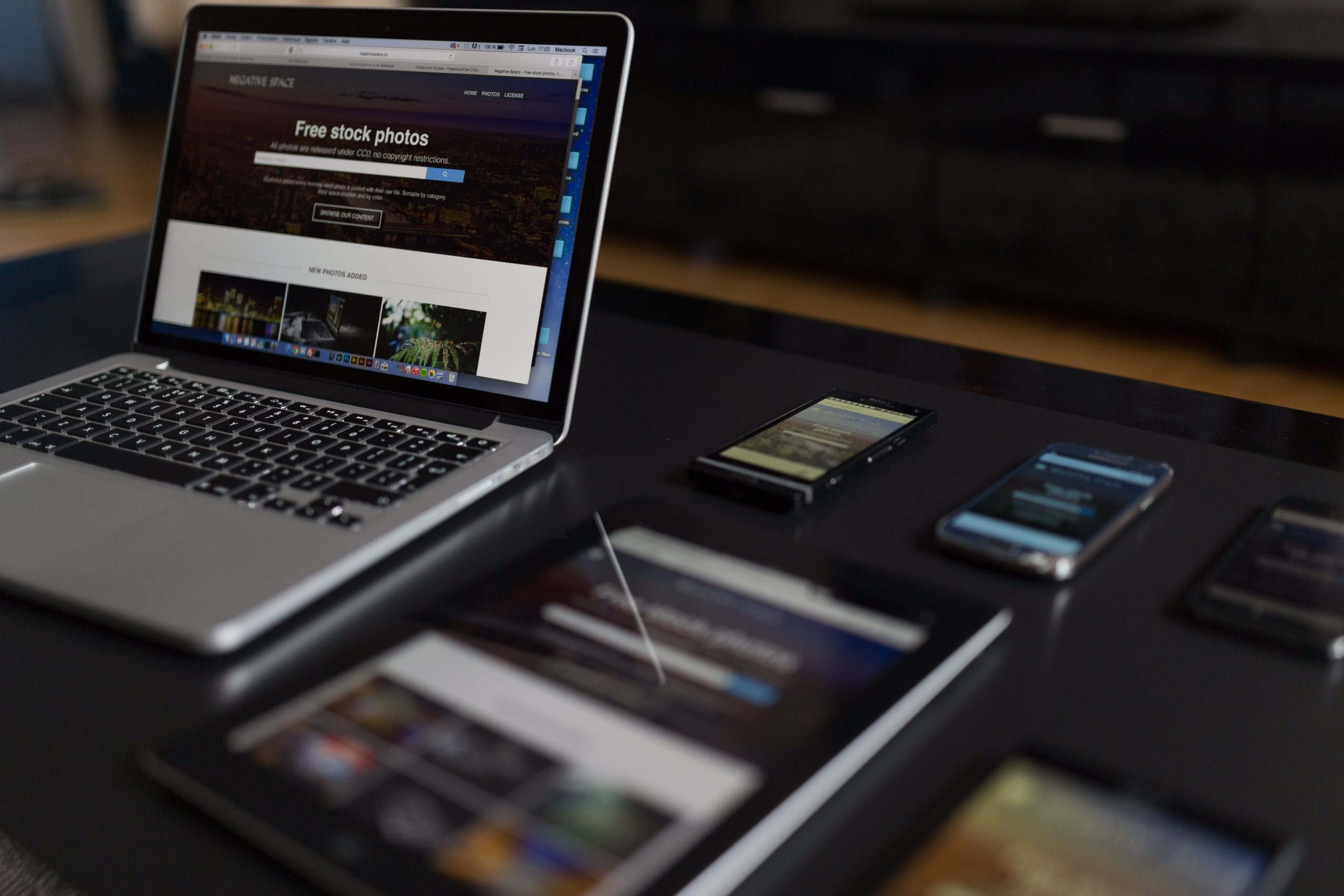
In today’s digital world, where users access the internet from a variety of devices, responsive web design (RWD) has become an essential element of web development. RWD is an approach to web design that ensures a website adapts its layout and content to different screen sizes, providing an optimal viewing experience for users across desktops, laptops, tablets, and smartphones.
What is Responsive Web Design?
Responsive web design (RWD) is a web design approach that prioritizes flexibility and adaptability to ensure a website looks and functions seamlessly across various screen sizes and devices. Unlike traditional web design methods that create separate websites for different devices, RWD utilizes a single codebase that dynamically adjusts the layout and content based on the user’s device.
Why is Responsive Web Design Important?
Responsive web design offers numerous benefits that make it crucial for modern websites:
- Enhanced User Experience: RWD provides a consistent and enjoyable user experience across all devices, regardless of screen size. This consistency fosters user satisfaction and engagement.
- Improved Search Engine Optimization (SEO): Search engines like Google prioritize websites that are mobile-friendly and responsive. RWD ensures your website is optimized for search engines, leading to better search rankings and increased visibility.
- Reduced Development and Maintenance Costs: With RWD, you only need to develop and maintain a single website, eliminating the need for separate sites for each device. This streamlines development and reduces ongoing maintenance costs.
- Future-Proofing: RWD ensures your website remains adaptable to future devices and screen sizes, protecting your investment and adapting to evolving browsing habits.
Key Principles of Responsive Web Design
- Fluid Grids: RWD utilizes fluid grids, where elements automatically adjust their proportions based on the screen size, ensuring optimal placement and readability.
- Flexible Images: Images should be scaled and optimized to display appropriately across different screen sizes, maintaining quality and visual appeal.
- Media Queries: Media queries allow the website to detect the device’s screen size and apply specific styling rules to different device types.
- Content Prioritization: Prioritize essential content for smaller screens, ensuring users can access crucial information regardless of device.
- Mobile First Approach: Consider mobile users first when designing the website’s layout and functionality, as mobile usage continues to surge.
Implementing Responsive Web Design
Several approaches can be taken to implement responsive web design:
- Mobile-First Design: Start by designing for the smallest screen size, then progressively enhance the layout for larger screens.
- Adaptive Design: Use media queries to adapt the website’s layout and content based on specific device characteristics.
- Hybrid Approach: Combine mobile-first and adaptive design principles to create a flexible and responsive website.
Testing and Optimization
Once your responsive website is implemented, it’s crucial to thoroughly test it across various devices and screen sizes. Use device emulators and real devices to ensure the website functions seamlessly and provides an optimal user experience.
Conclusion
Responsive web design has become an indispensable aspect of modern web development. By embracing RWD, you can create a website that adapts to the ever-changing digital landscape, providing a consistent and engaging user experience across all devices. With its numerous benefits and ease of implementation, RWD is a worthwhile investment for any website owner seeking to enhance their online presence and cater to the diverse needs of today’s digital audience.